How to Fix Low-Resolution Art Before You Print
Low-resolution art is the quiet way people waste a DTF sheet. Here is how to spot it, what genuinely fixes it, and why upscaling a tiny file will not.
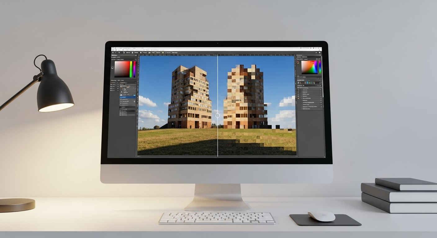
Nothing sinks a print job quieter than low-resolution art. The design looks fine at thumbnail size on your phone, you send it to press, and it comes out soft, jagged, or pixelated on the shirt. The frustrating part is that print reveals every flaw a small screen hides. A file that was never big enough to print sharp will print exactly as blurry as it truly is. This guide covers how to tell if your art is too low-res, what actually fixes it, and the hard truth about upscaling that saves people from wasting a sheet.
What resolution actually means for print
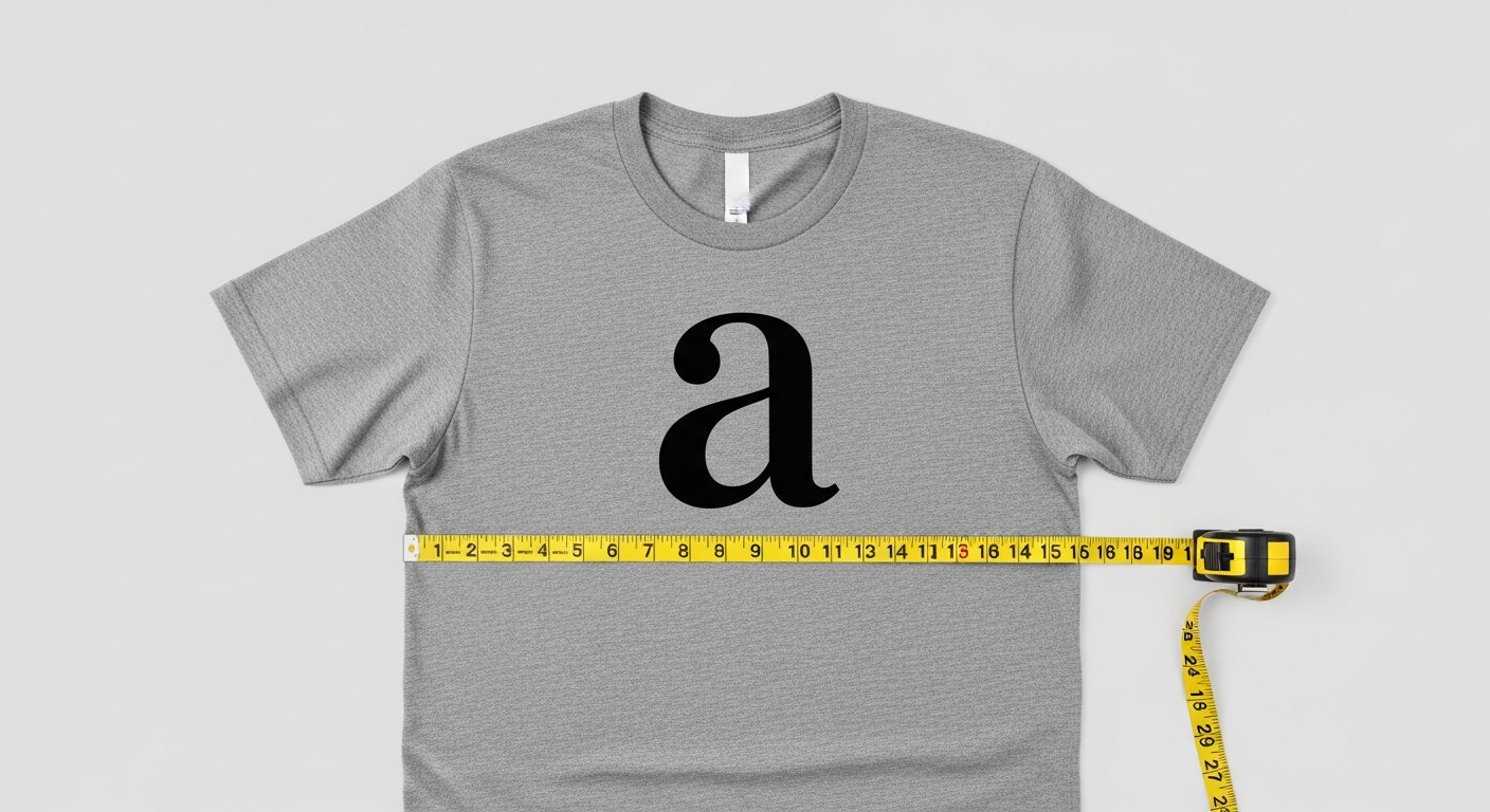
Resolution for print is measured in DPI, dots per inch, at the size you are printing. The target for crisp DTF transfers is around 300 DPI at the final print size. That last part is what trips people up. A 1000-pixel-wide image is plenty sharp for a 3-inch pocket print, because that is over 300 dots packed into every inch. Blow that same file up to a 12-inch back print and you are now spreading those same dots across four times the width, which drops you to well under 100 DPI. Same file, wildly different results, because print quality is about pixels relative to print size, not pixels alone.
How to spot low-res art before it costs you
You do not need special software to catch most resolution problems. A few checks catch the majority of them:
- Zoom to 100 percent, or the actual print size, on your screen. If edges look soft, jagged, or blocky at that size, they will print that way.
- Look for pixelation on curves and text, which show low resolution first.
- Watch for JPEG artifacts: fuzzy halos and blocky squares around edges from heavy compression.
- Check the file's pixel dimensions, not just its file size in megabytes. A heavy file can still be low resolution.
- Be suspicious of anything pulled from a social media post or a website, which are almost always compressed and downsized.
The fixes that actually work
There is exactly one reliable fix for low-resolution art, and it is to get a better source file. Everything else is a workaround with limits. Here is the order to try, from best to last resort:
- Find the original. Track down the high-resolution version from the designer, the brand's press kit, or wherever the art was first created. This solves the problem completely.
- Get a vector file. Logos and simple graphics are often available as vectors (SVG, AI, EPS, PDF). Vectors are resolution-independent and can be printed at any size perfectly sharp. This is the gold standard for logos and text.
- Recreate simple art. If it is basic text or a clean shape, rebuilding it in a design tool at full size is often faster than fighting a bad file.
- Redraw or trace complex art. For detailed illustrations, a designer can vectorize or redraw it at proper resolution. This costs time but produces a true print-ready file.
Why upscaling cannot save a tiny file
This is the part people do not want to hear. Dragging a small image bigger, or running it through an upscaler, cannot add detail that was never captured. When software enlarges an image it is guessing at the pixels in between the ones you have, and a guess is not real information. You end up with a bigger file that is either just as soft as before or smeared with invented, plasticky detail that looks off up close. The blur was baked in the moment the file was made small, and no tool reverses that. Think of it like zooming into a photo on your phone: the picture gets bigger, but it never gets clearer, because the detail simply is not in the file.
AI upscalers have gotten impressive and can help a little with photos, cleaning up mild softness. But they still invent detail, and on the crisp edges, fine text, and clean lines that DTF prints are known for, invented detail is exactly what shows. For a logo or text, an upscaled small file will almost always look worse than starting from a vector or the original. Do not count on an upscaler to rescue a job. Treat it as a last-ditch touch-up, not a fix.
How the builder catches this for you
The reason low-res art wastes money is that people find out after they have paid and pressed. Our builder at /builder is built to stop that. When you upload art, it flags any file that is too low resolution to print sharp at the size you have placed it, before you check out. You get to swap in a better file, resize the design smaller, or rethink the placement while it still costs you nothing. That single check quietly prevents one of the most common ways a DTF order goes wrong.
Setting up files right the first time
The easiest low-res problem to fix is the one you never create. When you or a designer build art for DTF, start at the size you intend to print and work at 300 DPI from the beginning, so you are never enlarging a small canvas later. Save logos and text as vectors whenever the tool allows it, and keep a high-resolution master of every design so reprints and resizes pull from a good source instead of a compressed copy. Export final art as a PNG with a transparent background at full print size. A little discipline at the file-setup stage removes almost every resolution surprise down the line.
The takeaway is simple. Print is honest, and it shows exactly what your file contains. Start from the highest-resolution source you can find, reach for vectors on anything with logos or text, and treat upscaling as a minor touch-up rather than a rescue. Get the file right first and the transfer takes care of itself, whether you are building a full sheet or ordering ready-to-press transfers at /transfers.
Frequently asked questions
Auto-nesting, low-res warnings before you pay, shipped same-day from Texas.
Open the builder →