DTF Transfer Size & Placement Guide (With Measurements)
Sizing and placement are where good transfers go wrong. Here are the real measurements for left chest, full front, and youth so your prints land right.
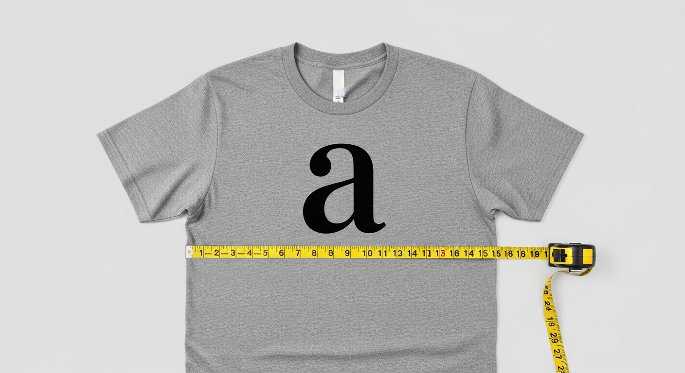
You can print a flawless transfer and still ship an ugly shirt if the size or placement is off. A logo that is too big looks amateur, one that is too small looks lost, and a crooked print looks careless no matter how sharp the ink is. This is the part beginners guess at and pros measure. Here are the real numbers for the most common placements so your prints land where they should, at the size they should be.
Standard transfer sizes at a glance
Size is measured by the width of the printed design, because width is what your eye reads first on a chest or back. These ranges cover the vast majority of adult apparel jobs.
- Left chest logo: about 3.5 to 4 inches wide.
- Standard full front or full back: about 10 to 12 inches wide.
- Oversized front or back: 12 to 14 inches wide for a bold, edge-to-edge look.
- Sleeve print: about 2.5 to 4 inches wide, running down or across the sleeve.
- Youth front: scale down to roughly 6 to 8 inches wide.
Width is your anchor. Set the width to the range above and let the height fall wherever the artwork's proportions take it. Never stretch art to force a height; that distorts the design.
Placement measurements that look right
Placement is measured from a fixed landmark on the garment, usually the shoulder seam or the collar, so it stays consistent across every shirt in a run. Grab a ruler and a heat-safe marker or tape and these become foolproof.
Left chest
Position the top of the design about 7 to 9 inches down from the shoulder seam, and center it roughly 4 to 5 inches in from the center line of the shirt, so it sits over the wearer's left chest. A common eyeballing trick is to line the print up with where a shirt pocket would sit.
Full front
Place the top of a full front design about 3 to 4 inches below the collar for a standard chest print. Center it left to right by folding the shirt in half lengthwise to find the middle, then aligning the design's center to that crease. For a lower, more modern placement, drop it slightly further down the chest.
Full back
For a large back print, set the top about 3 to 4 inches down from the collar seam and center it side to side the same way. Name-and-number or team backs sit a little differently, with the name high and the number filling the center of the back.
Sleeve
Center the sleeve print between the seams and position it a few inches up from the sleeve hem, keeping it straight along the length of the arm. Small and simple reads best here since the area is narrow.
Youth and different garment types
Kids' shirts are not just smaller adult shirts; the proportions change. Scale a youth front to roughly 6 to 8 inches wide and drop your placement measurements down proportionally, since a child's shoulder-to-chest distance is shorter. For toddler and infant sizes, go smaller still and rely on a test garment. Hoodies, tanks, and long sleeves each shift the safe zone too, so when in doubt, lay a printed paper template on the actual garment before you press.
Common sizing mistakes to avoid
Most placement problems come from a short list of repeat offenders. Knowing them ahead of time is faster than fixing a ruined shirt.
- Oversizing the front: a design that stretches past the safe chest zone crowds the seams and looks cramped. When in doubt, size down half an inch.
- Placing a left chest print too high or too low: too high and it rides toward the shoulder, too low and it drifts toward the belly. Stay in the 7 to 9 inch band from the shoulder seam.
- Ignoring the wearer's body: the same design centered flat can look off on a curved chest. Check placement on a filled-out shirt or a form, not just a table.
- Stretching art to fit a size: forcing a design wider or taller than its natural proportions distorts logos and text. Set the width and let height follow.
- Forgetting the collar and pocket: keep prints clear of the collar rib and any pocket so nothing overlaps awkwardly.
How to nail placement without guessing
The pros do not freehand it. A repeatable process gives you straight, consistent prints across an entire batch.
- Fold the shirt vertically to find and lightly crease the center line.
- Measure down from the collar or shoulder seam to the top of your design and mark it with tape or a heat-safe pen.
- Align the transfer to your center crease and your down-measurement mark.
- Step back and check it by eye before you commit heat; a print looks different flat than on a body.
- Press, then use that first shirt as your reference for the rest of the run.
A simple placement tool or alignment ruler speeds this up and keeps every shirt in a batch identical, which matters when a customer lines their order up side by side.
Size the art before you print, not after
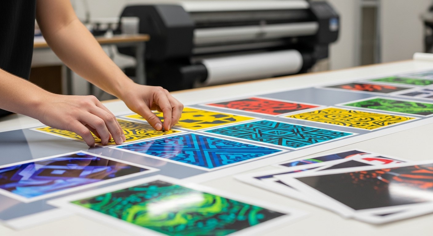
The cheapest time to fix sizing is before the film is printed. When you build a sheet at /builder, set each design to its finished print width right there so what you receive is ready to press with no surprises. If you are ordering ready-to-press pieces from /transfers, pick the listed size that matches your placement plan. Sizing on screen against these measurements takes a minute and saves a reprint.
Get width and placement right and even a simple one-color logo looks professionally made. Measure once, mark it, and press with confidence. The measurements above cover almost every apparel job, but the real skill is consistency: pick your numbers, write them on a card at your press, and use the same landmarks every time so shirt number one and shirt number fifty look identical.
Frequently asked questions
Auto-nesting, low-res warnings before you pay, shipped same-day from Texas.
Open the builder →